Hello: An App to Make Friends
Role: Lead UX Designer & Researcher
Goal: Create an app that helps people find others locally with the hope of creating new friendships.
INTRODUCTION:
Moving to a new place can be scary. You leave behind comfortable surroundings and arrive in somewhere foreign to you with the question of how will I adjust. Will I like it here? And most importantly, will I find and make new friends?
In today’s world where everyone is connected online, one assumes that we would already have all the connections we need in life. However it can still be challenging and awkward to meet people and eventually foster a new friendship. To alleviate some of the difficulty surrounding this issue, I created and designed an app to help people be introduced, connect, and then meet face to face with the goal to meet new people and develop new friendships.
PROCESS:
To get started I conducted nine interviews with individuals in my target audience (ages 18–40). The interviews were a series of open-ended questions to identify current behavior and opinions about the experience of finding and making friends. Some key takeaways were:
Everyone highly values friendships and communicates at least weekly with their current friends.
A small percentage had previously used an app to make friends. However everyone was interested in using one if it was done right.
In the past, friendships were made naturally in person either at school, work, and/or through mutual connections.
Proximity is an important factor in how people meet.
Finding people with similar interests is of importance when making friends.
A common challenge amongst all was finding time to make friends amidst their busy schedules.
With this information I began to visually map out what the journey of making a friend looked like. To begin, I wrote out the steps on colored notes, focusing on how the users felt and what they were thinking. Through this process I was able to identify the pain points or opportunities a user encounters while taking this journey.
Key to Colored Sticky Notes: Steps- Mint Green, Feelings- Pink, Thoughts- Yellow, Pain Points/Opportunities- Teal
The next step was to understand and assess the competition. I needed to learn from what already exists in the market and assess these products to learn what was working well, what could be improved and what other functions or features I could incorporate within my own product.
I compared four different apps that focus on social networking: Bumble, Scout, Nextdoor and Facebook. I did a competitive teardown that provided key insights into navigation as well as design and layout. Identifying common elements that echoed across all four apps — including icons, menu bar locations, and general profile information — helped me to understand how I could implement these same elements and expectations to continue what is universally common knowledge within social networking platforms.
With the research completed, I then created a user flowchart to gain an understanding of how someone would move through my product. Doing this ahead of the design phase required me to focus on what pages were actually needed to help the user move efficiently and effectively through the various functions and overall be satisfied with the product and experience.
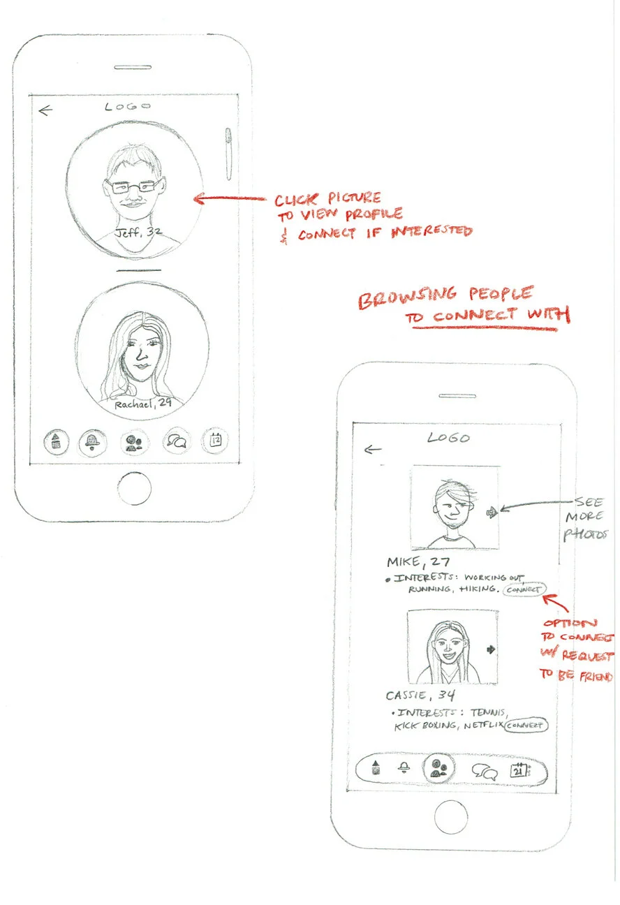
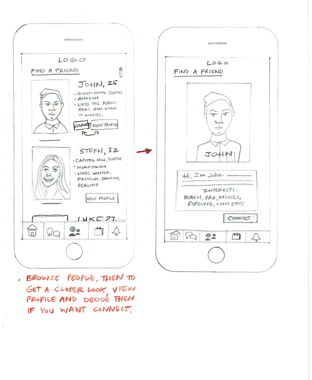
SKETCHES:
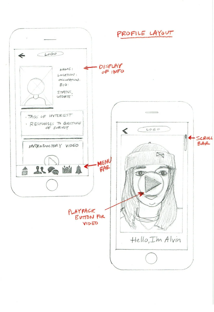
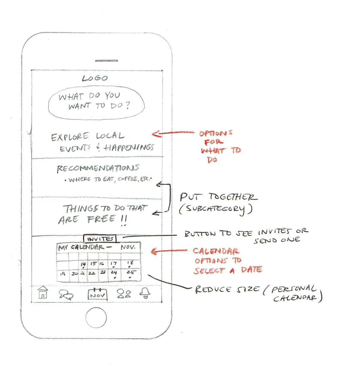
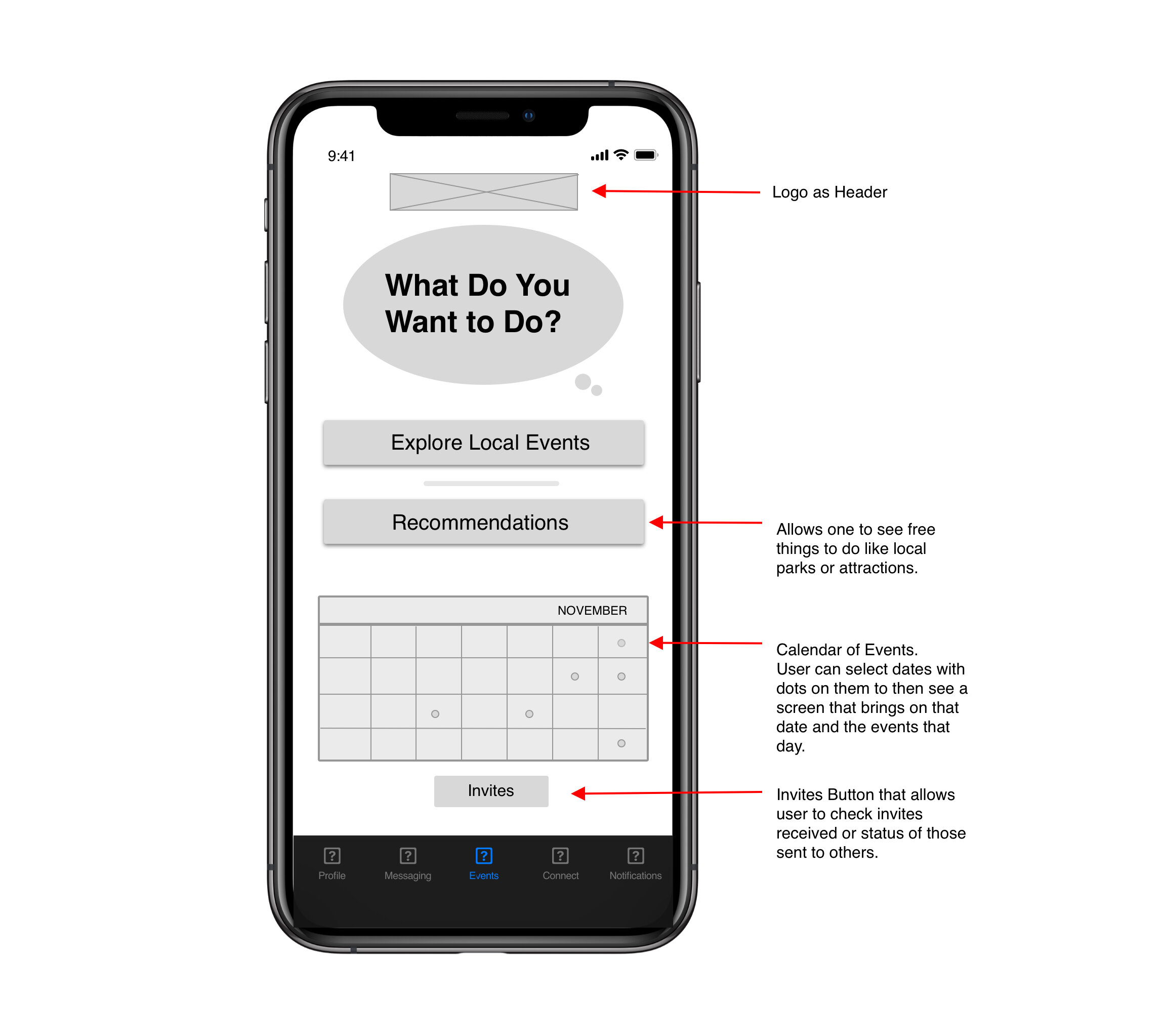
Next I created sketches of the three main pages in my product: (1) the user’s personal profile, (2) browsing other users, and (3) recommendations and ideas on what to do when meeting in person. I drew multiple layout variations to explore the best solution for helping the user navigate the page and accomplish their goal.
DESIGN:
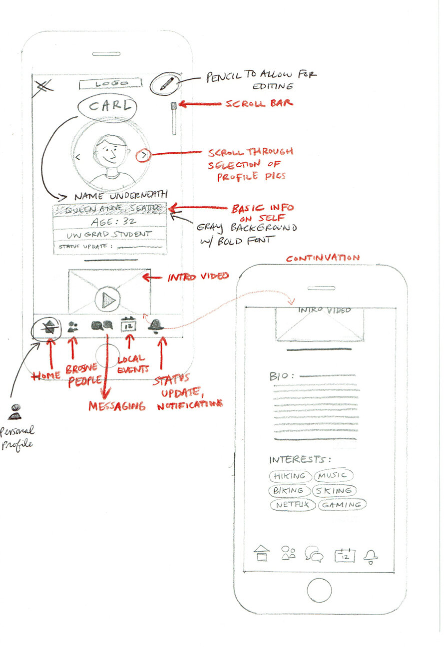
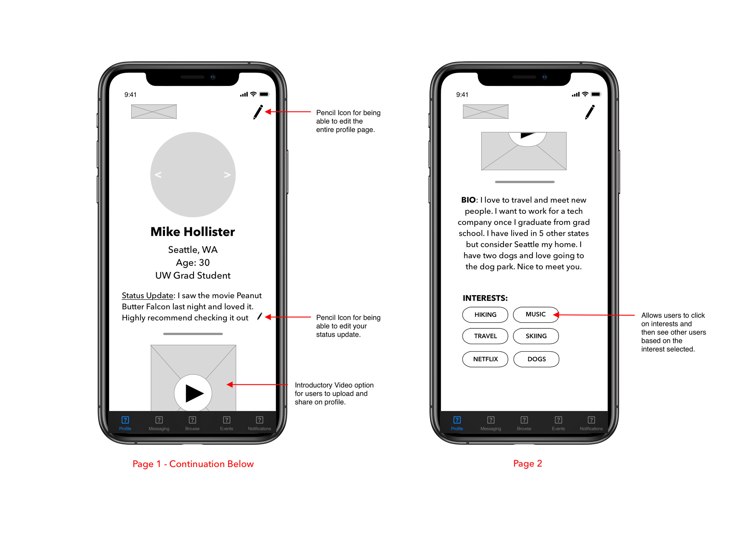
I received valuable feedback on the sketches and incorporated that advice when I began digitizing them into wireframes. I created two wireframe versions of three pages within the app for comparison and feedback on which elements were preferred.
The critique provided the following insight:
A rectangular shape for profile pictures was preferred despite the current design trend of circular ones.
The icons in the footer were recognizable and text underneath identifying them was not necessary.
The calendar design was sometimes mistaken for a user’s personal calendar synced with the app.
The images of the users within their profiles should be larger to get a better view of the individual.
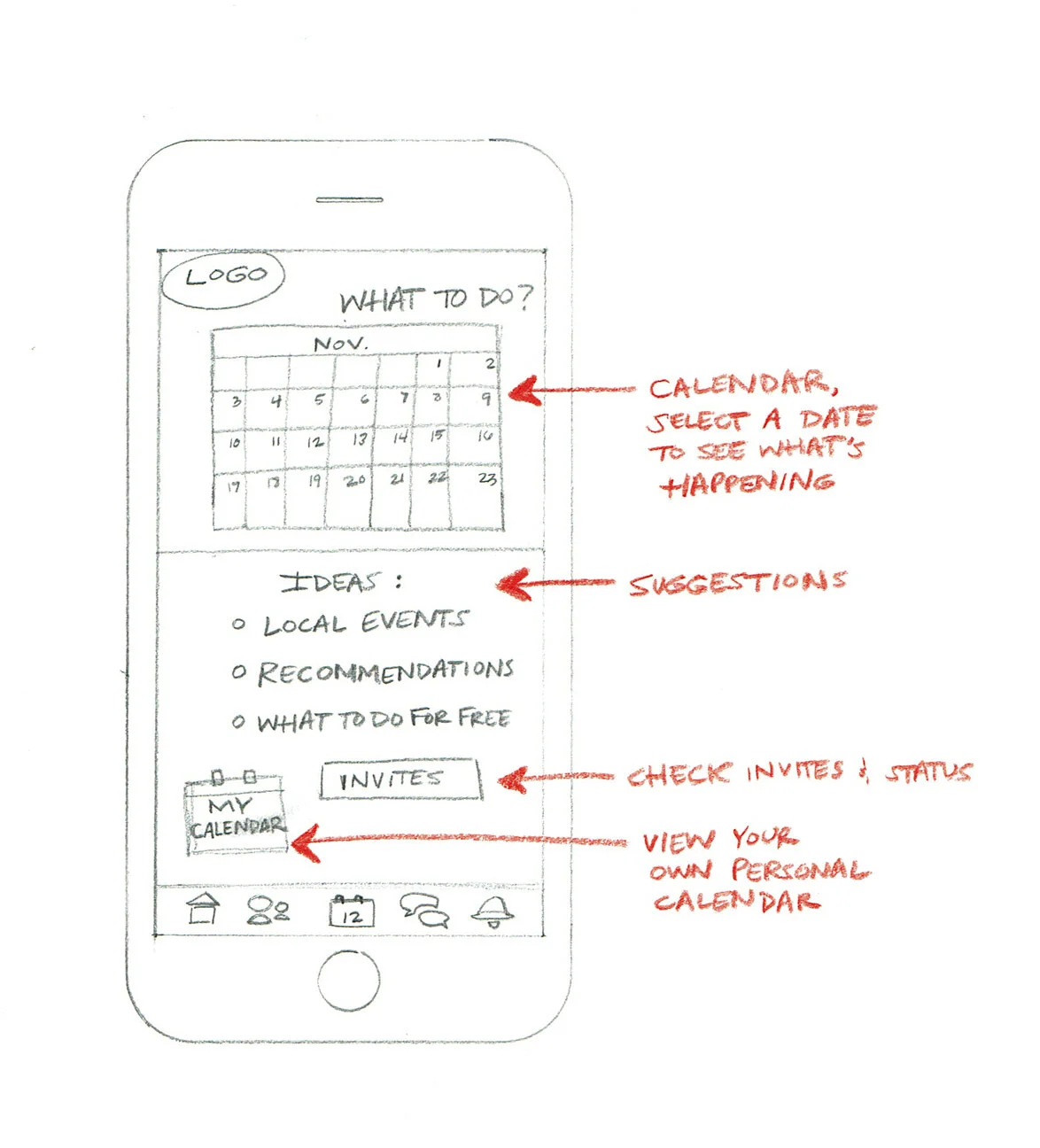
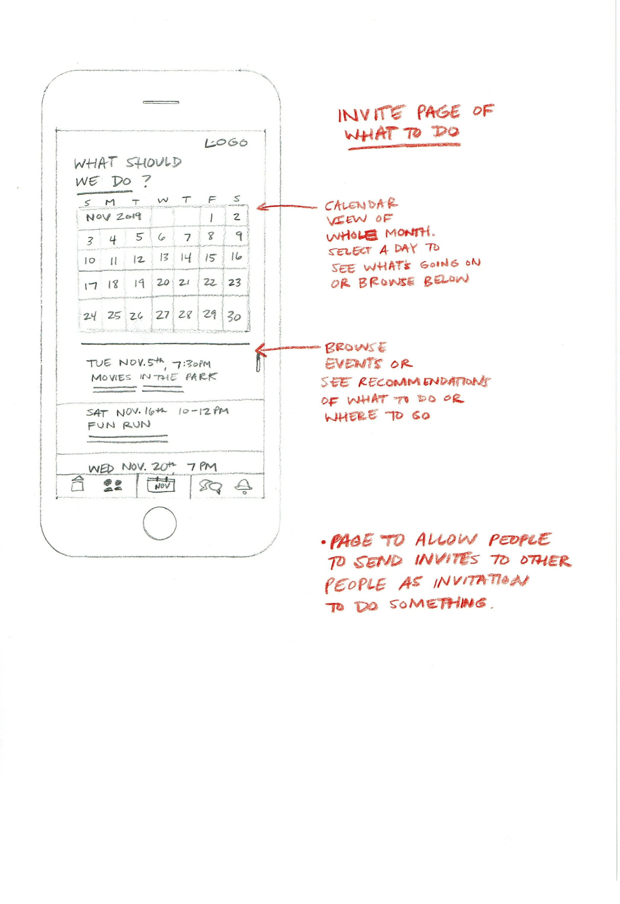
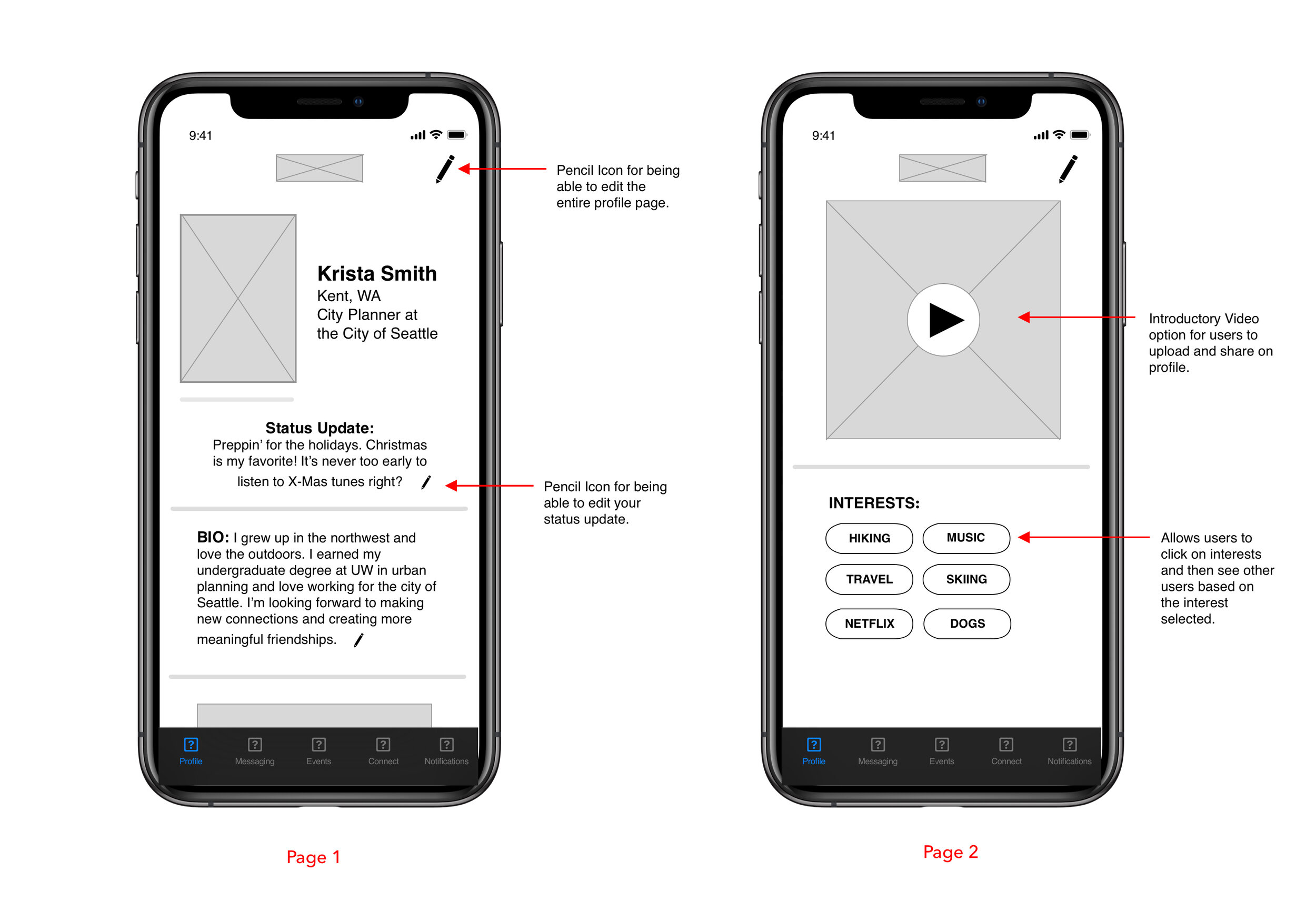
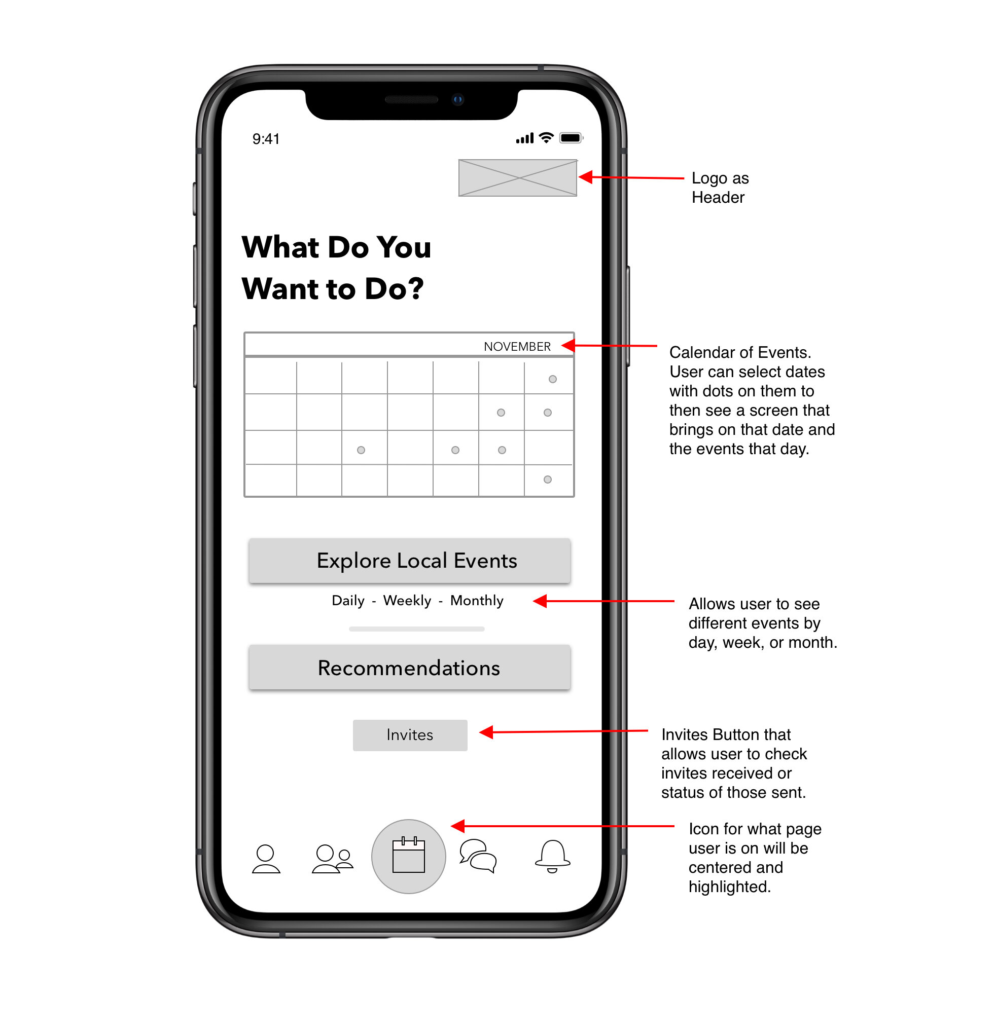
From the feedback I revised the designs by using the best elements from the two versions. Next, I created a low-fi prototype to test out the navigation and functions of my app. Here are a few views of some of the modified pages within the prototype:
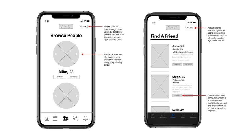
Modified Wireframes after feedback
With the prototype complete, I moved on to conduct several usability tests to learn if the features I had designed actually helped users meet new people, establish a connection and then give them an opportunity to meet in-person with the help of recommendations.
I selected four users who were from my target audience range and created a script with a series of questions to ask as they performed specific tasks within the app. These tasks and questions were:
Browse other users and select someone to connect with.
Explore your own profile page. Is there anything missing that you would include to better represent who you are?
Explore options of things to do on the ‘calendar’ page and send an invitation to a new friend. Was this easy to do and if not, what was difficult about it?
Send a message to your connection ‘John.’
While browsing other users, explore the ‘filter’ tab. Are there other preferences you would want to include with this feature?
I quickly learned that the path for my users was a little unclear at first. I had to provide a fair amount of explanation before and during the usability tests, which brought me to the realization that I should include a brief explanatory page clarifying the goal of the app at the beginning when a user is creating an account. Other notable findings were to minimize the amount of text on a user’s profile page since we tend to skim text and to include a ‘Filter’ or ‘Search’ option on the calendar page to funnel specific recommendations based on interests. After making these adjustments and fine-tuning, I produced a satisfactory design which is reflected in my final prototype linked below:
CONCLUSION:
I learned a lot throughout the entire design process. Being a UX team of one certainly has its challenges. In hindsight, I would have improved the overall process by focusing on creating a more refined business model and brand to separate my app from the competition. This would have helped add more character to the app by enhancing it with color and imagery. Overall, I’m proud of the resulting design and enjoyed creating a solution to a common challenge for many people.